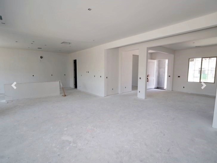
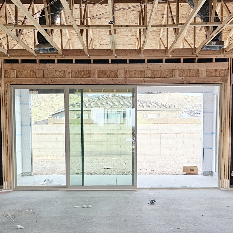
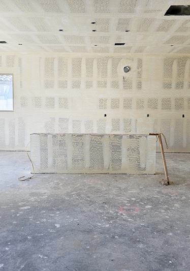
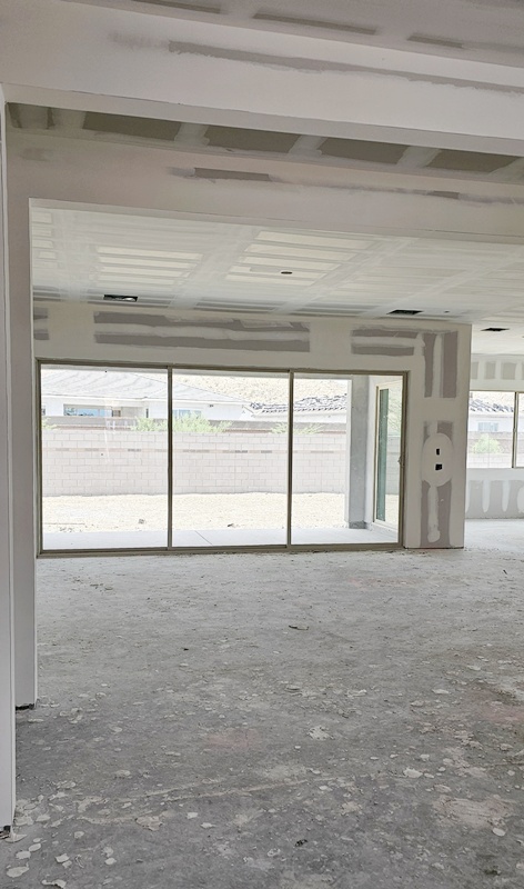
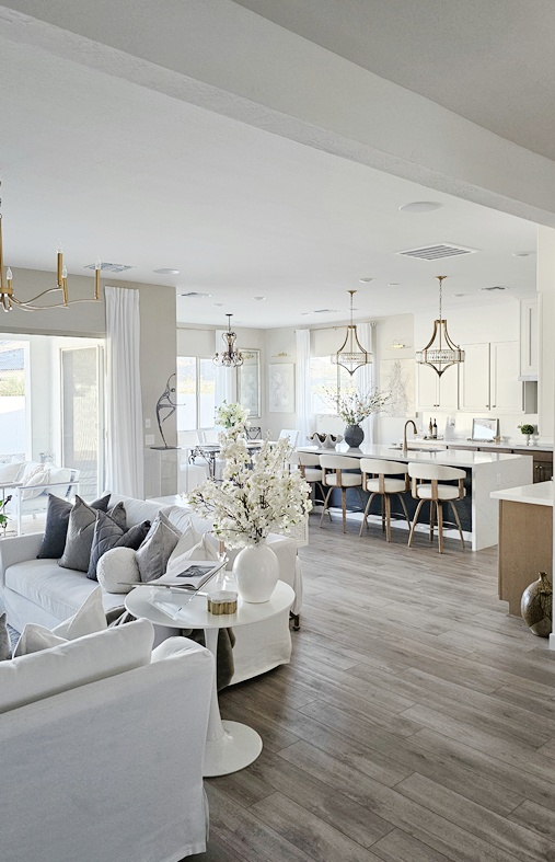
I should probably call this post “Grace Manor: Mostly Everything Else”, lol! When I was taking photos of the living room, I realized, there’s really no way to capture just the living room. And it was the same when I was photographing the dining room, and the kitchen, and the office, geesh!!! And honestly, I want to devote more of the rest of this year’s blogging to some other topics, so casting future segmented decor content aside, here’s the rest of the house… well almost! Disclaimer: It’s a long post, but not too long 🙂 This house is truly an open concept home, so you can stand in one spot and see it all. That said, let’s get right to it with some overall before and after’s (I don’t have many, ya’ll know me). Here is Grace Manor’s “most of the house”, lol!
This house is a bit larger than the last one, but the main size difference is in the height; it has 10’ ceilings, where all my other homes had 9’ ceilings. I hope the AC bills don’t take me out this summer! For the walls, I did pay to upgrade the paint to “extra bright white” through the builder, because I didn’t want to have to paint my whole house myself this time, AND, I thought I would love bight white again because, well… have you seen my last house?
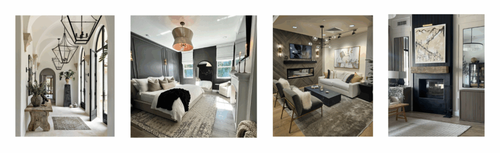
But once I was moved in, I didn’t love it, and I had to admit, it was an awful lot of white… those 10′ walls and all. So I went into design mode and began deep dives on Pinterest and YouTube for new light, but bright, yet a bit moody, sophisticated inspiration. I wanted my home to feel warm, but still bright. I had a running start having decided on contrasting bottom kitchen cabinets and the cabinets throughout the rest of the house, done in a quill maple finish wrap, which I absolutely love. With that as a lead-in to my color scheme, I landed on a palette of white, beige, tan, and grey, after falling in love with the following inspo pics…
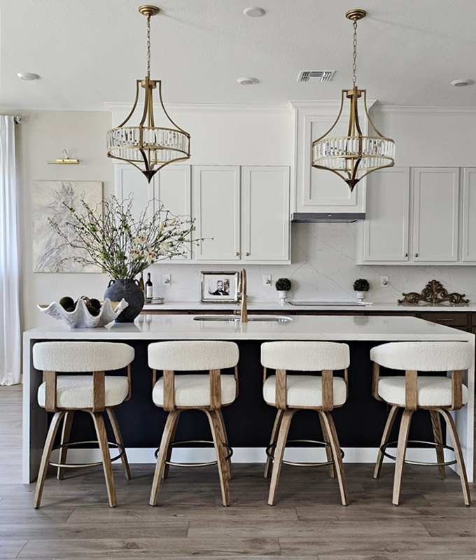
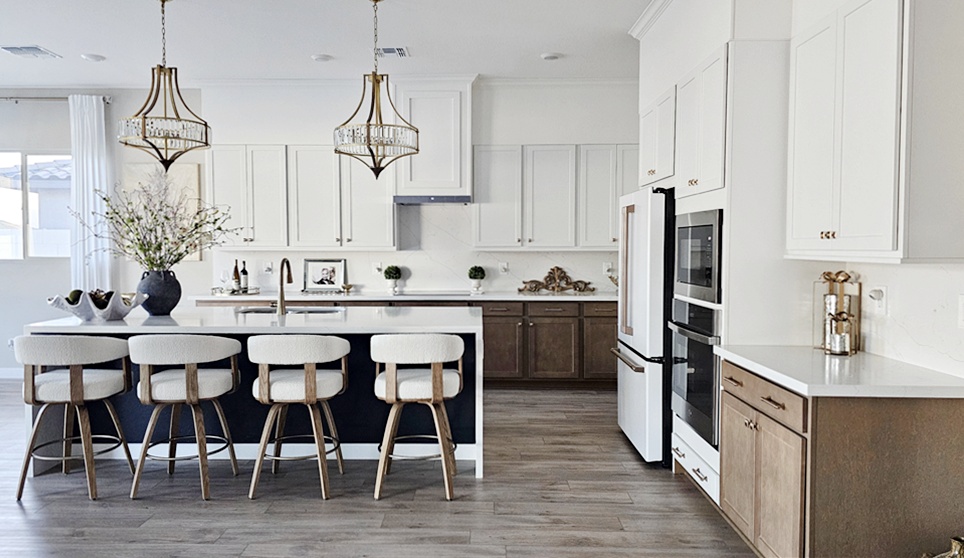
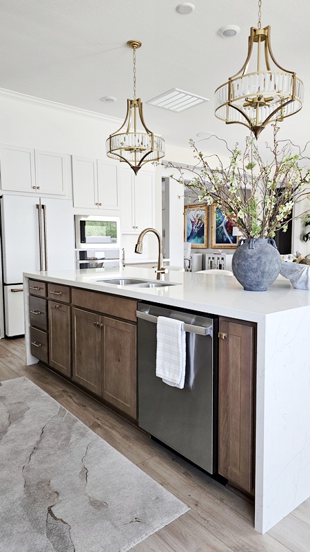
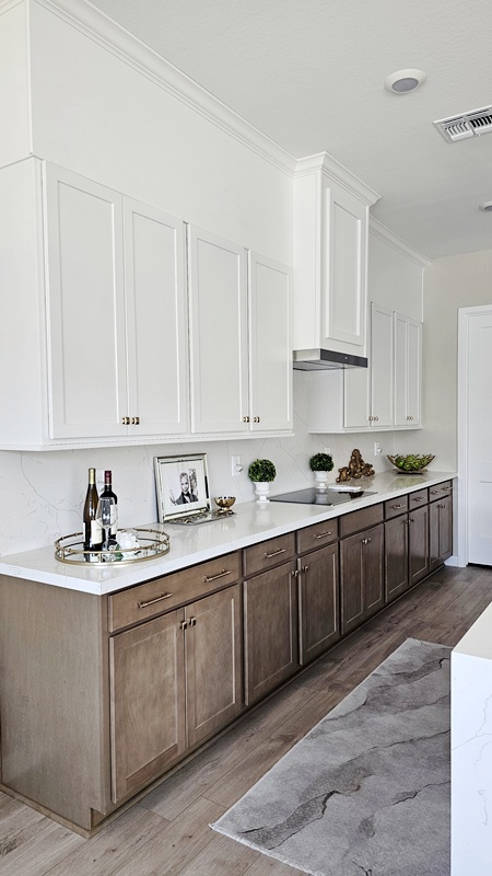
You all know the drill… I already had most of the furniture, decor and wall pieces, with most everything else purchased from Amazon, as you’ll see if you click on the links provided. Checking out the kitchen first…
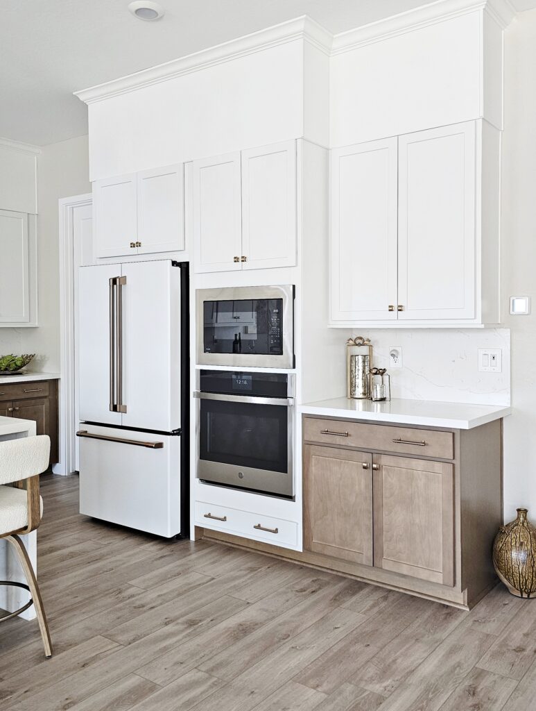
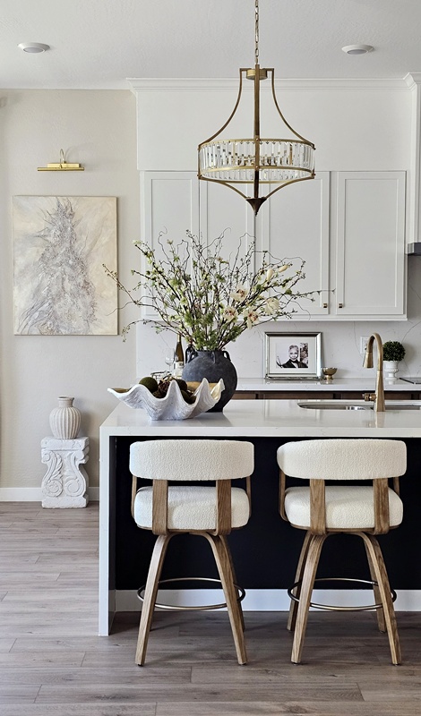
Switching hardware from chrome or brushed nickel, to champagne bronzed gold was a big thing for me. I’m not that into mixed metals, so I knew when I selected this hardware that I’d be swapping out the builder grade ones. For the kitchen sink, being the minimalist I knew I’d be with this island, I wanted something streamlined and sleek, so I settled on this faucet from Amazon, where all my other hardware swaps were purchased. The other purchases were the island stools, here, and the pendants, here. I tweaked these with a bit of custom spray paint, (but of course) to bring down the gold tone, and to match the other hardware a bit more.
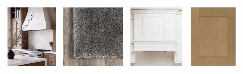
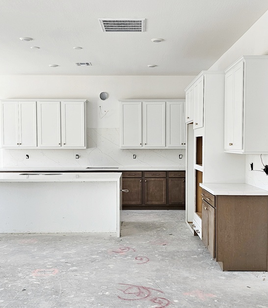
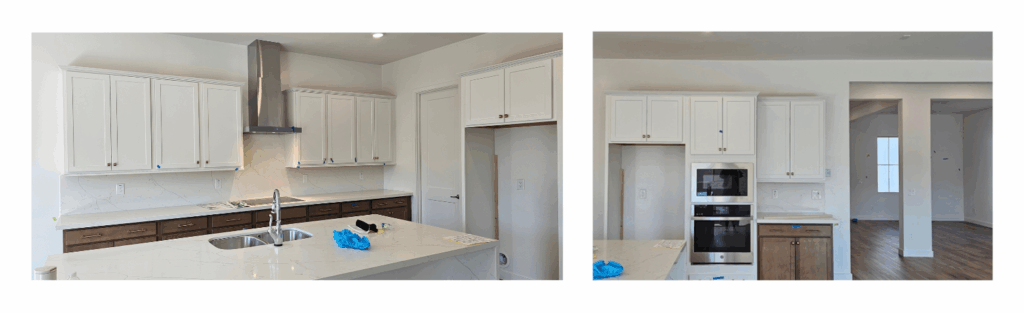
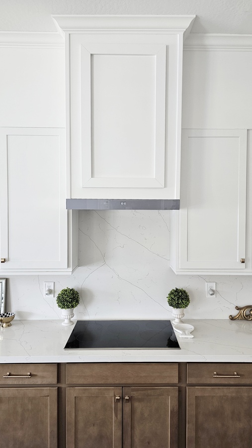
This is my first “contrast” kitchen, and I love it!!! I always knew I’d abandon the all-white everything kitchen at some point, but I still wanted it to be light and bright and simple. And one thing that was a must for me, was for the cabinets to have an extension to the ceiling. When I found out it would be an extra $9,800 to do that through the builder, it was a quick, “no, thank you.” Instead, I added that to my “after-build” list; that list I’ve talked about in several of my home posts before. The other “after-build” item to address on my list for this space was the very shiny vent hood. I did yet another deep dive on how to cover it, and with the help of a contractor, was able to extend my cabinets to the ceiling, add crown molding, cover the vent hood, and match the paint to my existing cabinets for $1,900, a fraction of that $9800. I still have some molding detail to add to go around the top portion, just a few inches below the crown molding, but this will definitely do for now, and I’m so very pleased with how it all turned out.
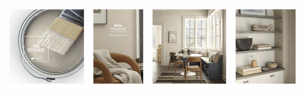
So who doesn’t know that I only use Behr paint? Haha! And when I tell you, it’s hard to find a beige colored paint that doesn’t have a heavy green undertone, and that isn’t the rest of the world’s favorite “Accessible Beige” by Sherwin Williams, it was really hard. I must’ve sampled at least 9 different colors before I found this one, “Behr Marquee’s “Even Better Beige“, (I even love the name) which I quickly became obsessed with, using it in most of the open spaces of the house.
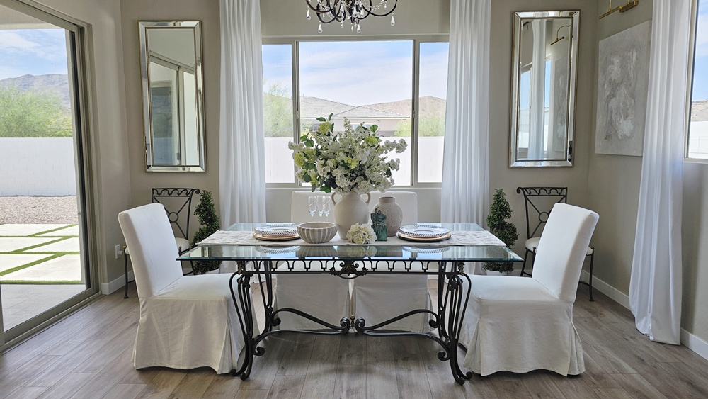
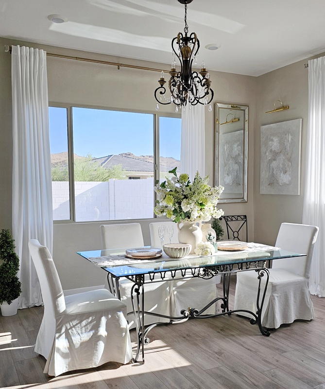
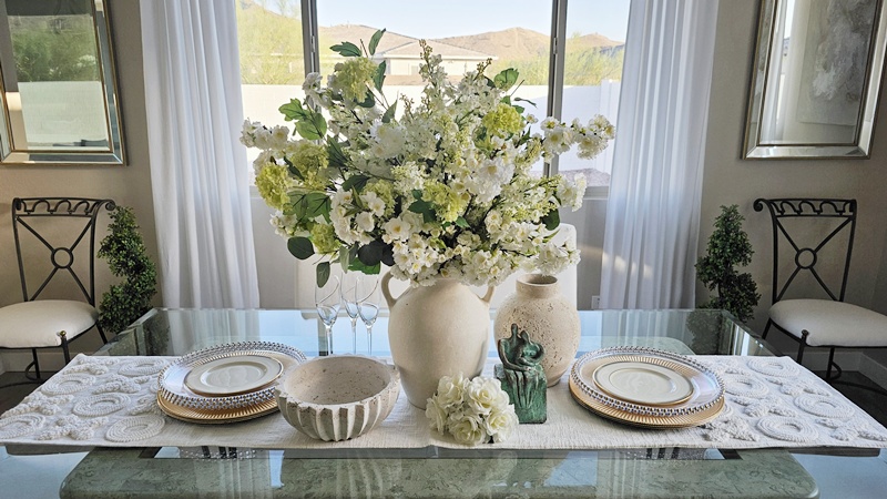
Moving on to the “kitchen-adjacent” space… the dining room.
This was the first space in the house that was actually completed. I wanted a simple, clean feel with a hint of Restoration Hardware without all the wood. I don’t know if I achieved that, but I’m happy with the final look. The only thing missing is the grey rug I’ve selected, but it’s coming. I’d also like to eventually swap the high back white dining chairs for ones with lower backs. And maybe one day I can see myself replacing the glass table with something else. (deep sigh) You’re never ever really “finished” decorating a house. Your tastes are always evolving 😊.
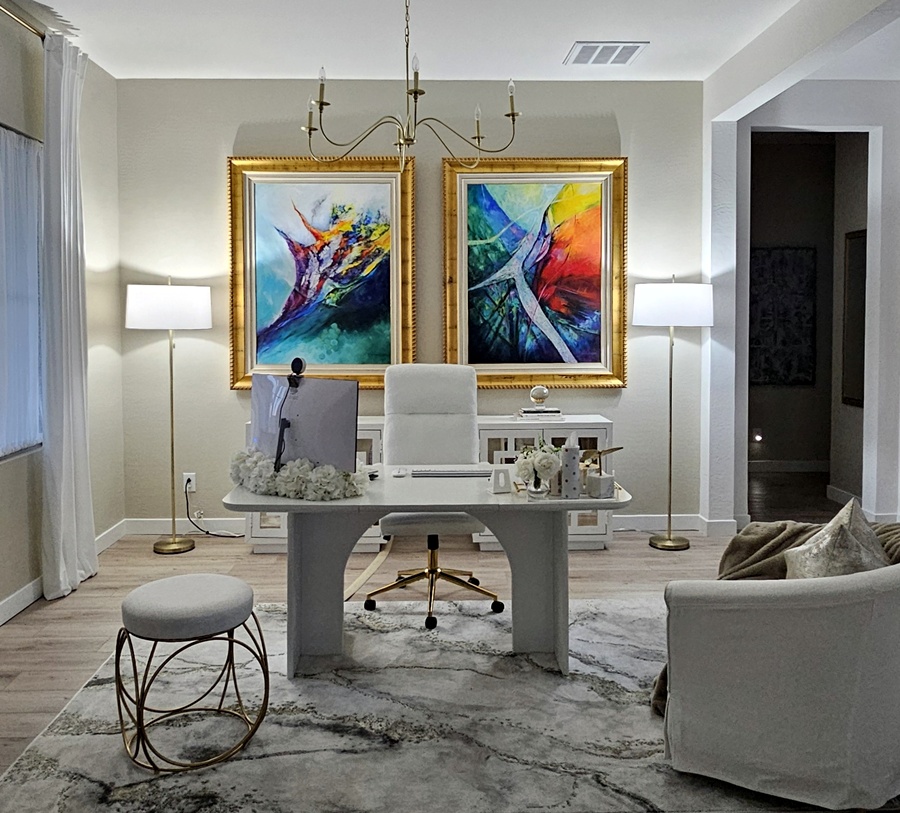
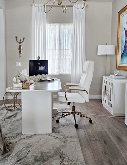
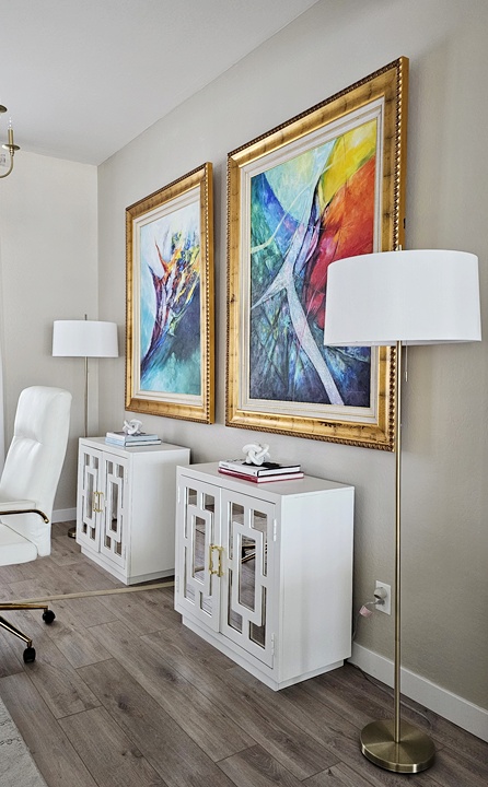
On to the Office… I’ve never been fond of homes with no foyers, where you walk in, and bam, you’re in the middle of a room. This home felt different, even though there is no formal foyer. I think because there’s a long walkway, with an open area to the left (and right, but that’ll come in another post), I was fine with it. And I decided to make the left-side space my office area.
The only purchases were the desk, which unfortunately is no longer available and was actually a dining table, the desk chair, the area rug, and the curtains all from Amazon. The chandelier is from Home Depot.
I’m still in search of cord-management decor. I absolutely hate to see cords, but I just haven’t found the decor pieces I’d like to sit on each side of the cabinets that would sufficiently do what I need them to. So it is what it is for now.
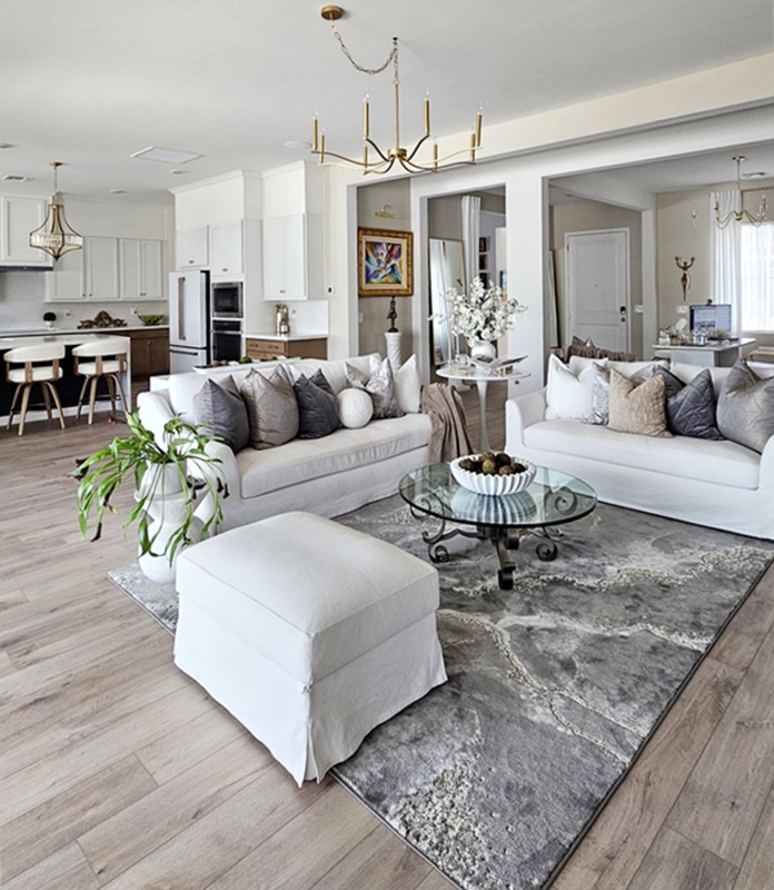
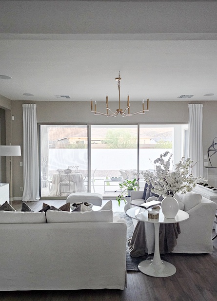
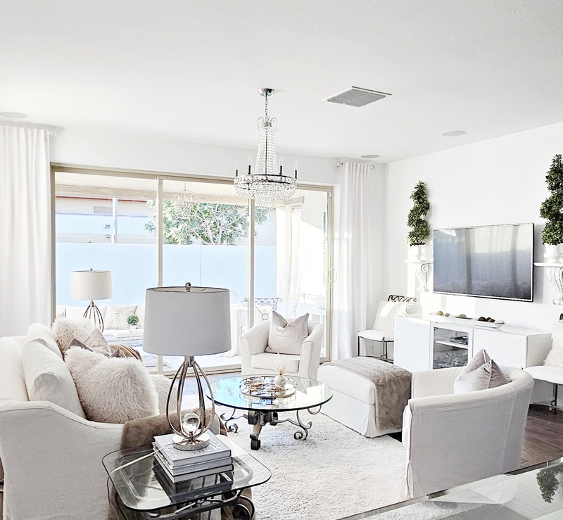
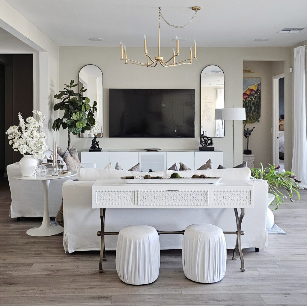
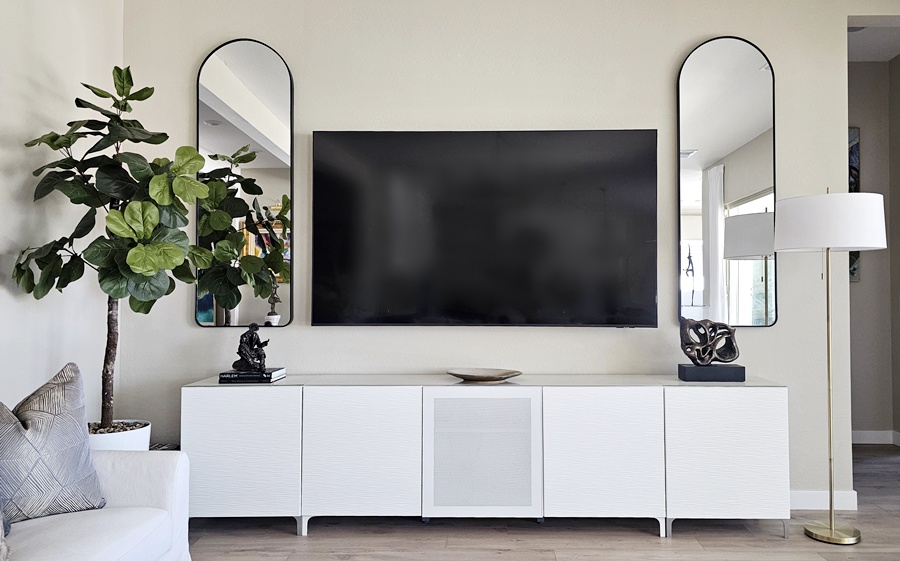
And finally, the living room; small and cozy.
These are the same sofas from the previous two homes. Funds were not flowing like a mighty river, so there was no room for new furniture in the budget. Even the entertainment credenza is the same (from Ikea). I just purchased two additional ends, extending the length to accommodate the new love of my life, my 85” television. And it wasn’t even that expensive! The area rug is linked here, as well as the chandelier, here. Eventually I’ll have an electrician move that chandelier to the center of the living space, from where it is now, which is the center of the builder’s measurements of the room, which extend to the sliders, and back a couple feet. I know, it’s confusing, but I’m a visual girl and I like my chandeliers centered to the actual room space, especially in the living area. At the same time, I’ll do a custom spray paint on this chandelier because it’s a bit too gold for me. But I’m in no rush.
There’s still the guest suite and the Momster’s Gallery, as well as a completely empty room that I haven’t decided what to do with yet, but that’s it for now. Don’t forget to say “Hi” in the comments and leave your thoughts. Thank you for stopping by. Until next time…
4 thoughts on “Grace Manor: Open Concept”
Pierre Robinson
Good afternoon Ingrid,
The house looks absolutely Magnificent Ingrid! In particular the before an after pictures that gives the viewer the evolution of what was and what is.
I just recently heard it said that “The strength of a woman is how she protects and creates the Atmosphere of the home.” You have definitely displayed that “Mamlakah”- Hebrew for Royal authority, sovereign power and creative dominion of your home.
Thank you so much Pierre! I appreciate you always taking the time to stop by and comment. After God, I’m positive the gift I have for interiors is from my mama, so I can’t take credit for any of it, lol! But I love decorating, and sharing 🙂


Good afternoon Ingrid,
The house looks absolutely Magnificent Ingrid! In particular the before an after pictures that gives the viewer the evolution of what was and what is.
I just recently heard it said that “The strength of a woman is how she protects and creates the Atmosphere of the home.” You have definitely displayed that “Mamlakah”- Hebrew for Royal authority, sovereign power and creative dominion of your home.
Peace & Blessings
Pierre
Thank you so much Pierre! I appreciate you always taking the time to stop by and comment. After God, I’m positive the gift I have for interiors is from my mama, so I can’t take credit for any of it, lol! But I love decorating, and sharing 🙂
Love how you mix color, texture, and finishes … Thanks for sharing!
Thank you Tracy for continuing to be a part of my community!